

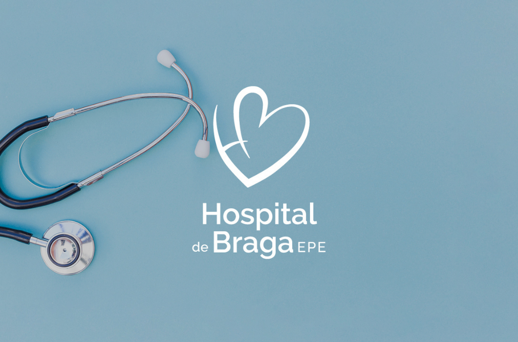
A simple, soft, and comforting heart subtly forming the acronym HB is the basis of the new logo of the Hospital de Braga, considered for several years in a row as one of the best health units in the country.
With the new logo, LKCOM designed all the communication supports and customizable articles of the hospital, from internal and external documents, archive and identification and signage elements, to everything used in the day-to-day by the hospital multidisciplinary teams, patients and visitors, incluiding the bed sheets, cushions and professionals scrubs.
The color remains green of hope, dedication, health, and vitality.